SPLENDOR MAGAZINE

A Frame Behind Fiction
See Full Magazine

ROLE

Layout Design, Editorial, Typography

DURATION

12 Weeks

TOOLS

Adobe InDesign, Adobe Photoshop

OVERVIEW

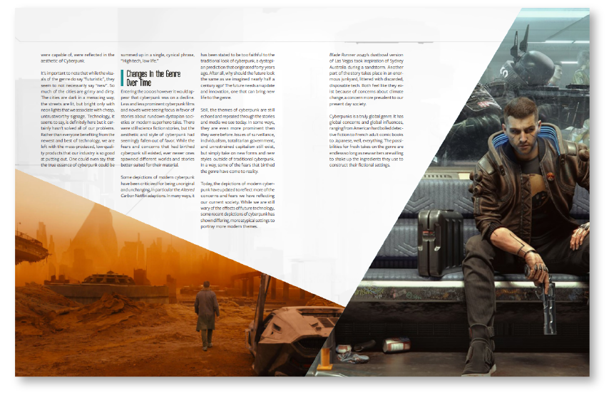
SPLENDOR Magazine is a quarterly magazine dedicated to the worldbuilding, concept, and creation of popular science-fiction and fantasy media. It is aimed at those in the 15-35 age range who are interested in learning more about the things they love and how they are made.

SPLENDOR comes from my own interest in science fiction and fantasy, but more specifically how I have always been interested in the process, dedication, and passion behind a piece of work can be a story in and of itself.

CHALLENGE

While there are many magazines that have a high appreciation of science-fiction and fantasy, the genres and topics behind them cover a broad range of stylistic influences and styles. How might we encompass this variety while also providing a specific point of view?

SOLUTION

SPLENDOR Magazine dives into the story behind the story, the concepts, background, and behind-the-scenes of popular fantasy and science fiction. SPLENDOR aims to let the beauty of the works speak for themselves, serving as a museum and showcase of the amazing fictional worlds that are right outside our imagination.

Brand and Identity

When looking at other magazines that had sci-fi or fantasy focus, I noticed that many of them were very busy and chaotic, deliberately so in a "collage style". My main inspiration came from "The Art of" series, art books that went over the concept art and design from popular movies or video games.


I intended my magazine to have a similar tone to a traditional art museum, where the fantastical imagery speaks for itself while the text and style is minimalist and respectful, using heavy white space and light colors. This subdued tone would be a calm space to allow the reader to have a sense of appreciation.

Visual Language

For my inspiration moodboard I created a scale for my overall brand tone. This was important as this scale would dictate the overall identity and how far I would push the style and imagery of my magazine, serving as a self-created guideline.


In particular, the usage of geometric shaping served as the overall unification of my visual identity and how far to push that visual choice.

Original Flatplan

Creating a flatplan is one of the earliest steps when creating a magazine. Serving as a general roadmap to the contents of the magazine, the goal was to put in place the article lengths, ad placements, and order of each article.
Throughout the process of creating the magazine, while the order of each article remained the same, the length of the articles changed drastically. In this project, flexibility was a necessity when creating the final product.
Illustrations/
Animation
GDC - Intel
LinkedIn
Email
Resume
© 2022 Justin Leung - Designed and animated by me